
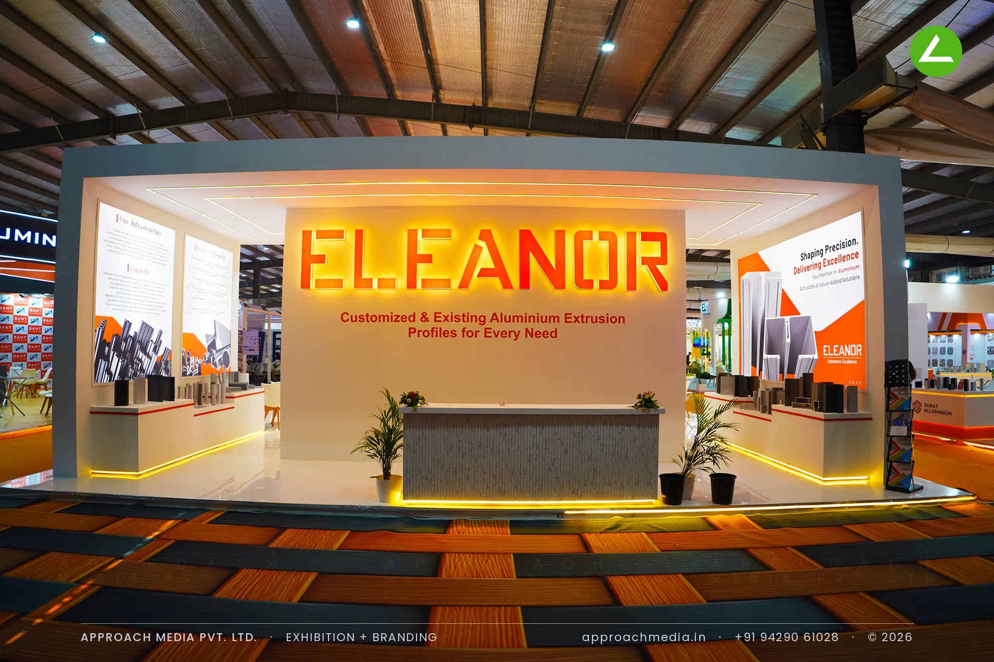
At Aluminium Bharat 2026 in Gandhinagar — the ALEMAI-organized aluminium industry exhibition held 26–29 September at Helipad Exhibition Centre — Eleanor Industries Pvt. Ltd. received the Gold Award for Best Stall Design & Execution, presented on stage in the show's Best Stall Design category for stands of 72 sq. m and above. The stall that earned it — a 110 sqm, four-side-open island — was designed and fabricated by our team at Approach Media.
We're proud of that, and prouder for Eleanor's team, whose brief, products and trust shaped the stand. But this article isn't a victory lap. An award is a jury's recognition of design and execution; it is not, by itself, proof of business results — leads, meetings and orders are earned on the floor, by the exhibitor's people and products, during and after the show. What an award does confirm is that a stand communicated clearly and was built well, and those two things are worth studying, because they're repeatable.
So here is the useful version of the story: what effective exhibition stall design consists of, why each design decision matters to a visitor and to the business behind the stand, and what the Eleanor stall — photographed, documented and now recognized — demonstrates about getting it right.
What makes exhibition design effective
Strip away the render-portfolio glamour and exhibition design is a communication discipline with six working parts. These are professional design principles — not the jury's scoring criteria, which organizers don't publish and we won't pretend to know.
Brand clarity. A visitor should know whose stand this is, and what that company does, from the aisle — before any conversation.
Visual hierarchy. The eye should land on things in the right order: name, offer, product, person to talk to. When everything shouts, nothing is heard.
Spatial planning. Where people enter, how they move, where they pause, and where conversations happen — decided deliberately, not left to furniture placement.
Product presentation. Especially in B2B, the product is the argument. Display should make a technical offer inspectable, not just visible.
Visitor comfort. Light levels, circulation width, seating, and a place to talk without shouting. Comfortable visitors stay longer; staying longer is where business starts.
Execution quality. The finished stand has to match the approved design — in proportion, finish, alignment and lighting. A brilliant concept built poorly reads as a poor concept.
Everything that follows is these six principles, opened up.
Why design matters, decision by decision
Visibility across a busy aisle
The decision: height, massing and lighting that register from 20–30 metres away. For the visitor: your stand becomes a destination they steer toward rather than a surprise they pass. For the business: footfall starts with being findable; buyers at trade shows plan routes, and visible stands get added to them. Common mistake: spending the budget at eye level and leaving the top third of the stand dark and blank — the exact zone visible over the crowd.
First impressions and perceived professionalism
The decision: disciplined geometry, clean finishes, coherent colour. For the visitor: an instant, mostly subconscious judgement — this company is organized. For the business: B2B buyers use visible quality as a proxy for operational quality; a tidy stand quietly answers "will their deliveries be tidy too?" Common mistake: visible cable runs, scuffed plinths and misaligned panels — small individually, decisive in aggregate.
Brand recognition through colour, signage and message
The decision: one palette, one logotype treatment, one line of messaging, repeated consistently. For the visitor: the brand becomes memorable after one pass and recognizable on the second. For the business: recall is what survives the show — buyers shortlist from memory and photographs days later. Common mistake: treating every wall as a fresh canvas; five messages in five styles produce zero recall.
Immediate clarity about the offer
The decision: a plain-language statement of what the company makes, readable from the aisle. For the visitor: the three-second question — is this relevant to me? — gets answered without effort. For the business: clarity filters traffic in your favour: the right visitors walk in, the wrong ones walk on, and your staff's time concentrates on fits. Common mistake: leading with slogans that could belong to any company in any industry, while the actual offer hides in a brochure.
Entrances, sightlines and circulation
The decision: open frontage, clear entry points, display arranged so the eye travels into the stand, and walkways that don't pinch. For the visitor: entering feels effortless and socially safe — no barrier to step over, no reception desk blocking the mouth of the stand. For the business: every bottleneck is a queue of conversations that never happened. Common mistake: a counter placed square across the entrance, turning the stand into a shop window people inspect from outside.
Product displays that explain a technical offer
The decision: products shown at inspectable height, grouped logically, with cut sections, samples or demonstrations where the product's quality lives in its detail. For the visitor: they can touch, compare and understand — which for technical buyers is the sales conversation's first half. For the business: a display that pre-answers "what exactly do you make, and how well?" shortens every conversation that follows. Common mistake: posters about products instead of products.
Lighting that works for signage, products and people
The decision: layered light — identity lit to carry distance, products lit to show true finish, and ambient warmth where people sit. For the visitor: the stand feels composed; products look like engineering, not inventory. For the business: lighting is routinely the strongest value-for-money upgrade on a stand — we've made this point in our cost guide, and it holds at every budget. Common mistake: one flat wash over everything, which flattens the hierarchy the rest of the design worked to build.
Meeting space, comfort and access for everyone
The decision: a place to sit and talk — enclosed where confidentiality matters — plus level access, reasonable aisle widths inside the stand, and somewhere to put a visitor's bag and a cup of tea. For the visitor: the stand invites a conversation rather than a pamphlet pickup, and welcomes every visitor, including those for whom steps and squeezes are barriers. For the business: serious buyers need seated minutes, not standing seconds; stands without meeting space export their conversations to the café, where competitors sit at the next table. Common mistake: sacrificing the meeting room for one more display bay.
Photography and what the stand does after the show
The decision: at least one composed, well-lit view designed to photograph cleanly. For the visitor: nothing — this one is for everyone who wasn't there. For the business: the stand becomes content — website, social media, proposals, next year's planning — and a case study if it performs. The Eleanor stand is doing exactly that job in this article. Common mistake: discovering at the show that no angle photographs well because every view is cluttered.
Differentiation without clutter
The decision: one memorable move — a form, a lighting effect, a display idea — on an otherwise restrained stand. For the visitor: the stand is distinct and legible; novelty draws them in, clarity keeps them. For the business: differentiation that adds noise costs recall; differentiation that adds focus compounds it. Common mistake: competing focal points — a mascot, a game, a video wall and a product launch, all shouting at once.
Case study: reading the Eleanor stall
Eleanor Industries makes customized and existing aluminium extrusion profiles — their stall messaging said exactly that, with the line "Shaping Precision. Delivering Excellence." on the wall. The stand we designed and fabricated for them at Aluminium Bharat 2026 was a 110 sqm island, open on all four sides, built to 4 m height (the full project, with photographs, is on our portfolio).

What the photographs show — and what each visible choice was doing:
| Visible design feature | Design interpretation | Potential visitor benefit |
|---|---|---|
| Predominantly white architecture with a long-radius curved perimeter wall | Restraint as a frame: the structure recedes so brand and product carry the attention | A calm, legible stand that's easy to read in a visually loud hall |
| Illuminated orange-red ELEANOR channel lettering, repeated on multiple faces | High-contrast identity lit to carry across aisles, consistent from every approach | The stand is findable from a distance and nameable from any direction |
| Strong rectangular overhead frame with recessed, cove-lit ceiling | A defined "roof" that marks the stand's territory and bounces soft, even light below | A sense of entering a place, not just stepping onto carpet |
| Open, uncluttered entrances on all four sides | No thresholds, no barriers — circulation designed before furniture | Walking in feels effortless; no bottleneck at any single mouth |
| Reception counter with warm under-lighting | A lit landmark that says "start here" without blocking entry | Visitors orient instantly; staff greet rather than guard |
| Warm floor-wash beneath plinths (the "floating" effect) | Light used to lift the architecture and guide the eye to display level | Products and structure read as composed and deliberate |
| Product plinths with cut sections and an upright bundle of full-length profiles | The extrusion itself presented as both specimen and sculpture | Technical buyers can inspect detail; everyone else still understands the offer at a glance |
| Clear offer statement and capability graphics on the walls | The "what do you make?" question answered in passing | Relevant visitors self-select and walk in already informed |
| Glass-walled meeting room, seating and plants | Conversation infrastructure: privacy with sightlines, comfort without clutter | Serious discussions get seated minutes inside the stand |
Two honest boundaries on this reading. First, these are our design intentions and what the photographs support — not measured visitor behaviour, and not the jury's reasoning, which only the jury knows. Second, the award belongs to Eleanor's stand and Eleanor's team; our part was the design and fabrication documented on the project page.
Why restraint, for an industrial brand? Because Eleanor's product is precision. A stand of clean lines, controlled light and exact finishes makes the argument the company itself wants to make — the architecture performs the brand promise instead of decorating it. For industrial and manufacturing exhibitors generally, this is the transferable lesson: when your offer is precision, discipline is the spectacle.
Design and execution are one job, not two
The award category says it plainly: design and execution. A concept earns nothing until it stands, level and lit, before the gates open.
The journey runs: brief → concept and 3D visualization → engineering drawings and organizer approvals → fabrication → pre-dispatch assembly → on-site installation → handover. Quality can leak at every joint between those stages. Proportions that looked right in a render can feel wrong at full scale; finishes specified in one batch can arrive in three; signage can sit ten millimetres off its centreline; a lighting plan can die by one missed electrical submission. (How organizer approvals work is its own discipline — at shows run from exhibitor manuals, deadlines are unforgiving.)
The protections are process, not heroics: one team accountable for both design and build; full assembly and mock-up testing before dispatch rather than discovery on site — our workshop standard on every project; lighting and electrical planned as part of the design, not an afterthought; and a build schedule that finishes before the deadline, not at it. We've written about the venue itself — Helipad Exhibition Centre, Gandhinagar — and about exhibiting at Aluminium Bharat; both guides make the same point from different angles: the stands that look effortless on day one were unglamorously well-managed in the weeks before.
One caution against a tempting assumption: Eleanor works in aluminium, but that does not mean the stand's structure was aluminium — the documented build used curved MDF perimeter walls, acrylic channel letters and fabric graphic panels, chosen for what exhibition structures must do: build fast, finish clean, photograph well.
Connecting design to business outcomes — responsibly
Here is the honest chain. Good design increases attention: more people notice, approach and enter. Design plus the right offer statement converts attention into qualified engagement: the visitors who enter are disproportionately the ones you want. Engagement infrastructure — displays, demos, meeting space — converts qualified visitors into conversations worth following up. And consistent identity converts the whole experience into recall when shortlists are drawn up weeks later.
What design cannot do is close deals by itself, rescue an unprepared team, or substitute for follow-up. An award recognizes the first links of the chain; the exhibitor forges the rest.
If you want to know whether your stand worked, measure the chain, not the compliments: qualified enquiries logged against a definition you set before the show; meetings completed in the stand's meeting space; demonstration or sample-inspection participation; and opportunities still alive 60–90 days after the show. Those four numbers, compared edition to edition, tell you more than any applause — and they're the numbers that justify next year's budget.
Common mistakes, and how to correct them
- Overcrowding the floor. Every extra display eats circulation. Fix: decide the walkways first; let display capacity be what's left.
- Too much text. Walls of copy go unread. Fix: one offer statement at aisle scale; detail goes in conversations and documents.
- Competing focal points. Fix: choose the one thing a passer-by must remember; subordinate everything else to it.
- Hidden or blocked entrances. Fix: counters parallel to the aisle or inside the stand — never across the mouth.
- Flat or missing lighting. Fix: layer it — identity, product, ambience — and plan electrical loads at design stage, not on site.
- No meeting space. Fix: protect conversation space early in the layout; it's the last thing to cut, not the first.
- Copying another company's stand. What won for them expressed their brand and products. Fix: borrow principles, never layouts.
- Starting late. Late briefs compress design, approvals and fabrication, and every compression costs quality or money. Fix: brief your builder six to eight weeks out, and earlier for complex builds — the timeline logic is in our cost guide.
A practical planning checklist
Before your next show, put answers against each line:
- Objective: what, specifically, must this stand achieve — and how will you count it?
- Audience: who are the visitors that matter, and what do they need to see to stop?
- Key products: which two or three carry the story? (Everything cannot be the hero.)
- Brand message: one sentence, aisle-readable, that says what you do.
- Layout: entrances, circulation, display zones, meeting space — in that order of priority.
- Signage: name visible from distance, offer visible on approach, detail visible inside.
- Lighting: identity, product and comfort layers; electrical requirements declared early.
- Meetings: how many seated conversations at once? Private or open?
- Access: level entry, workable widths, welcome for every visitor.
- Organizer requirements: manual read, drawings submitted, deadlines in a calendar.
- Budget priorities: spend where visitors look and touch; save where they don't.
- Execution responsibility: one accountable team from design through handover.
- Follow-up: who owns the leads on the Monday after the show?
The lesson in Eleanor's recognition
The Gold Award for Best Stall Design & Execution at Aluminium Bharat 2026 belongs to Eleanor Industries — their brief, their products, their team on the stand. What the recognition affirms is a way of working: decide what the stand must say, say it with discipline, and build it exactly as designed. Design made the brand easy to notice and understand; execution made the intent real; Eleanor's people did the rest.
That approach isn't reserved for award nights. It's available to any exhibitor willing to start early and decide deliberately.
See the Eleanor Industries project in full on our portfolio — and if you're planning your next exhibition stall, we're glad to talk through what thoughtful design could do for it. Concept and costing within 48 hours, fixed-price.
Discuss your next exhibition stall →
## FAQWhat award did the Eleanor Industries stall win? The Gold Award for Best Stall Design & Execution at Aluminium Bharat 2026, Gandhinagar (26–29 September 2026), presented in the show's Best Stall Design category for stands of 72 sq. m and above. The stall was designed and fabricated by Approach Media.
Does an award-winning stall guarantee more leads? No. Design increases attention and makes engagement easier — the stall must still be staffed, worked and followed up. Measure qualified enquiries, completed meetings, demo participation and 60–90-day opportunities to judge real performance.
What made the Eleanor stall's design effective? Based on the documented project: a 110 sqm four-side-open island with restrained white architecture, high-contrast illuminated lettering visible from every aisle, open entrances, layered lighting including an under-plinth floor wash, products displayed as inspectable specimens, and a glass-walled meeting room for seated conversations.
How early should an exhibitor start planning a custom stall? Brief your designer six to eight weeks before the show for a typical custom stall, and earlier for large or complex builds — organizer drawing approvals land weeks before opening, so design decisions must be frozen early.
Does a stall need a big budget to benefit from good design? No. The principles — clarity, hierarchy, open circulation, layered lighting, honest product display — apply at 18 sqm as much as at 110. Disciplined design is about decisions, and lighting in particular rewards every budget level.
About the author
Mehul is a Director at Approach Media Pvt Ltd, an exhibition stall design and fabrication company in Ahmedabad operating since 2002.
Related
- Phygital Exhibitions: Connecting Your Stall With Digital Before, During and After the Show
- Exhibition Stall Layout Design: How to Plan a Stall That Generates Leads
- India's Exhibition Industry in 2026: Growth, Opportunities and What It Means for Brands
- Immersive Exhibition Stalls: How to Create Experiences Visitors Remember
- Stand Design Approval: How Organizer Submissions Actually Work
- RE+ 2026: A Booth Guide for Indian Clean-Energy Exporters
- METEC + wire + Tube India 2026: One Build Window, Four Shows
- Sustainable Exhibition Stall Design in India: A Practical 2026 Guide
- Exhibitor's Guide to India Expo Mart, Greater Noida
- How AI Is Changing Exhibition Stall Design in India (2026 Guide)
- India ITME 2026: Building a Stall for a Six-Day Machinery Marathon
- 8 Stalls at iPHEX 2026: Building for the Export Buyer
- CPHI & PMEC India 2026: Two Venues, One Pharma Week — Plan Accordingly
- Exhibitor's Guide to Yashobhoomi (IICC), New Delhi
- Windergy India 2026: Stall Planning When Your Product Is 100 Metres Tall
- CPHI Milan 2026: A Stand Guide for Indian Pharma Exporters
- Beautyworld Dubai 2026: A Stand Guide for Indian Beauty & Fragrance Brands
- Anuga FoodTec India 2026: Stall Planning for Food Technology Exhibitors
- Aluminium Bharat 2026: Exhibiting at Gujarat's Aluminium Showcase
- 14 Stalls, One Build Window: How We Delivered at PharmaTech Expo 2026
- REI Expo + The Battery Show India 2026: One Venue, Two Shows, One Plan
- SEMICON India 2026: Stand Planning for a Precision Industry
- bauma CONEXPO INDIA 2026: Stand Planning When Your Exhibit Weighs Tonnes
- Exhibitor's Guide to Helipad Exhibition Centre, Gandhinagar
- Custom vs Modular Exhibition Stands: Which Should Indian Exhibitors Choose?
- Double-Decker & Mezzanine Stall Rules in India: What You Must Clear Before You Build
- How Much Does Exhibition Stall Design & Fabrication Cost in India? (2026 Rates)
- What Drives Exhibition Stand Cost in Dubai? A Guide for Indian Exhibitors
- Exhibition stand builders in Ahmedabad